Macy’s
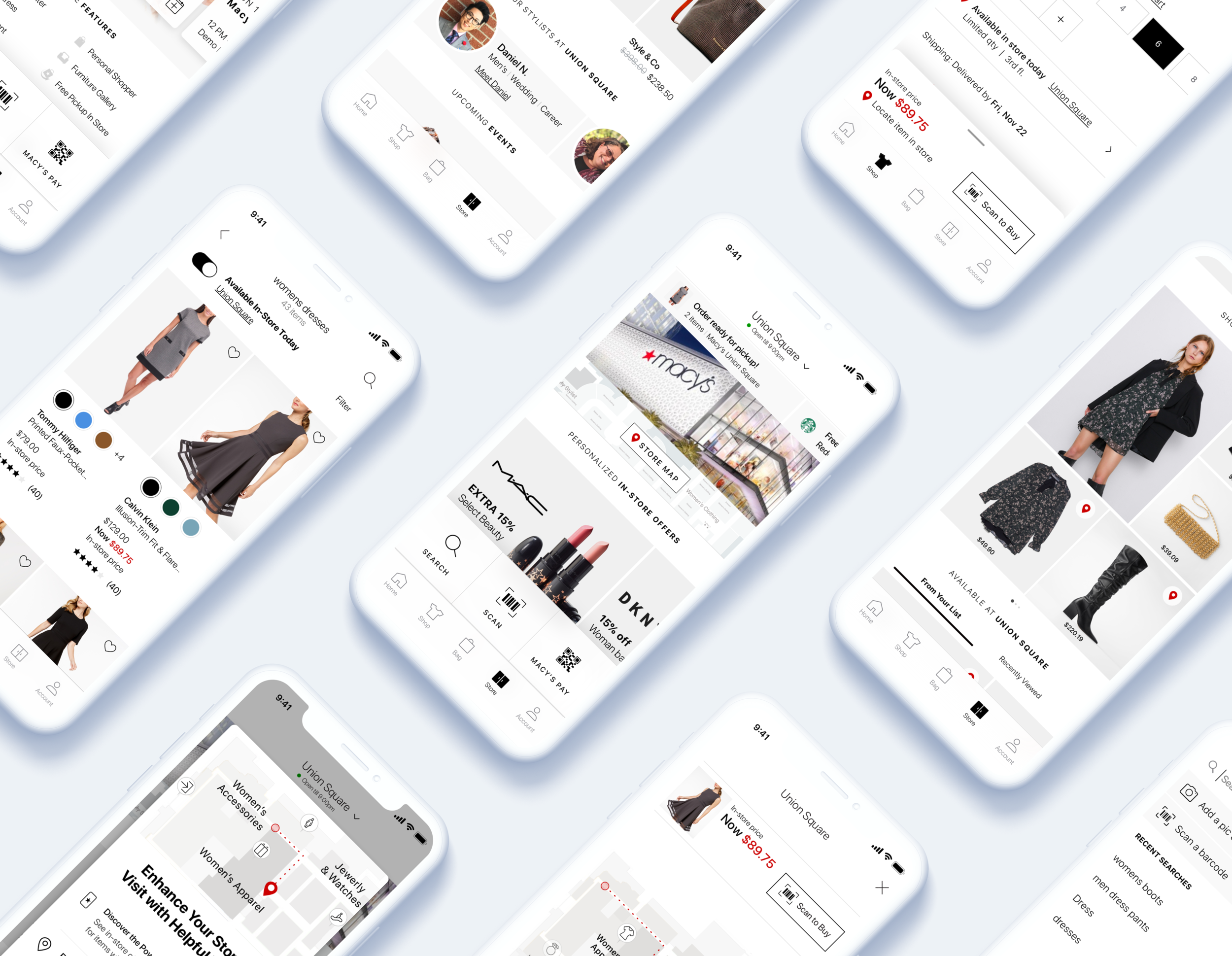
Entirely rethinking how customers use the Macy’s app for shopping in-store.
What I did: User research, Information architecture, Interaction design, Visual design, Prototyping
Overview
The Macy’s app Store tab (ie: Store Mode) is responsible delivering an annualized $395M in app-influenced sales. From helping customers plan their in-store visits to providing effective and intuitive tools for use while in the store, Store Mode enables customers to have a genuine omnichannel experience.
Project goals
Reimagine, then redesign the complete experience for the Macy’s app in-store journey. Create a place in the app that focuses on delivering convenience, value, personalization, and inspiration to app customers both at home and in-store.
Store Mode is where customers can go to plan their in-store visit, see events and store features, and use app-specific in-store tools. In spite of all these features, recent customer insight reports indicated that customer’s main pain-points were not being addressed.
These findings coupled with an increase in competitors targeting the in-store experience, lead Macy’s to undertake project to fully rethink how the app could help customers both in-store and at home.
Define
Over the course of 2 months, the Store Mode redesign was the largest cross-functional initiative I undertook while at Macy’s. I partnered with nearly all app in-store product managers and engineers to completely rethink this new experience.
It all started with an in-depth field research exercise which lead into an intense 5-day sprint followed by weeks of iterations and testing.
Discover
I partnered with our Sr. User Researcher and another designer to plan out an extensive competitive analysis review. I created a feature check list and a heuristics analysis study based on specific tasks for a 2-phased in-store and at-home field research study. This required working with product to identify the features we’d evaluate across our competitors then compile it into a detailed research packet containing everything our researchers would need to complete the study.
Research goals
Work with 13 field researchers (across UX/Dev/Prod) visiting 11 stores to evaluate 22+ features
Complete a feature checklist and perform a heuristic evaluation against key tasks customers might perform
Gain a better understanding of the current competitive landscape and prepare to share “Big Ideas” in the upcoming week long Design Sprint
Strengthen partnerships with senior leadership in Product and Dev to gain early buy-in and commitment at the start of the redesign project

“Never in my 2+ years at Macy’s did I ever see a more detailed competitive deep dive evaluation. It was a thoughtful and practical approach for getting user feedback and driving stakeholder alignment to drive the user experience and vision.”
— Ghalib Hussaiyn | Sr. Product Manager, Stores domain
Ideate & Prototype
Working with key stakeholders from all departments, we followed Jake Knapp’s Design Sprint steps to define, ideate, & create 2 testable prototypes in 5 days! ( ok 6 since we finished with testing on Monday :P ) During the sprint I was the one responsible for building both prototypes and made changes to them between testing sessions.
Our focus was to come out of the sprint week with a baseline direction for the redesign that was in alignment with stakeholders and more importantly customer exceptions.
Further iterations
The weeks following the sprint were full of whiteboard sessions, rapid iterations, and daily design reviews. I worked on combining the findings from our sprint prototypes into options which I presented to our team and senior leadership.
It started with lower fidelity designs to first define the content and structure then moved into more polished comps as we got closer to a version we’d retest.
Beating the competition
Throughout the redesign, we took a strategic approach towards ensuring that our design solutions were more inclusive than our competitors while staying aligned with the information our customers were expecting from the Macy’s app.
I created “competition killers” where I took competitor apps, designed a copy of it but with Macy’s content, then compared that to our current redesign direction to see if there were elements from it that might be incorporated into our own redesign.
Coordinating redesigns across UX
Part of the Store mode redesign effort also included coordinating with several other members on the UX team who were leading redesign efforts for other areas of the app. To ensure our redesigns stayed consistent throughout the app, we setup a war room where we’d regularly meet and share our design’s progress.
Final solutions
The final iteration of the Store mode redesign featured an increased focus on improving the convenience & value elements for our customers while also introducing completely new personalization & inspirational features.
Designing for use cases
Research, customer interviews, and current app metrics that Search, Scanning, Product Location, & Paying were the main use cases for the app. We ensured that the redesign not only updated the Store tab but that we also addressed these important steps in the customer journey. In addition to working on the Store tab page, I specifically focused on search and elements of product location and scan.
Using ethnographic research to validate the redesign
After helping create a fully interactive version of our redesign in Principle, I went to Macy’s Union Square with our Sr. Researcher as part of a 2 day testing session where we followed participants around the store and asked them to perform a series of tasks using the new redesign. Over the course of ~2 hours with each participant, we were able to ascertain where our redesign was meeting customer needs and where we could further improve the experience.
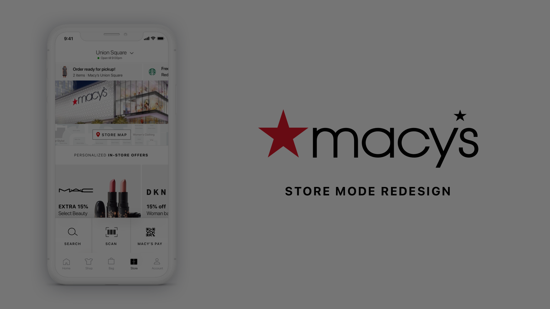
Video walkthrough of the prototype
Research insights
Below are key findings we uncovered during the in-store research exercise. These findings will go onto serve as the basis for additional revisions as we continue to refine the design.
Key Findings
Ensure scrollable affordance on the Store page to show more content behind the three main toolbelt items and to cue customers there’s additional content
Enhance discoverability for online and in-store pricing on the PDP
Explore other copy for Scan entry point
Continue moving forward with directly taking customers to Store mode and utilize an information modal for 1st time visitors
Explore options for prompting customers to turn on location
Continue Store icon and copy testing to ensure customers comprehend Store Mode.
What’s next
After presenting the Store Mode our VPs of Product & Design we plan to conduct a similar follow-up research study with participants in their homes to learn more about how the updated experience can help customer plan in-store visits. We’ll continue to partner with engineering and product to explore more detailed use cases and plan a phased approach for executing the new Store Mode experience.
