showd.me
showd.me is a peer-to-peer learning platform used for training new and existing employees within organizations.
What I did: Information architecture, Interaction design, Visual Design
Overview
Simplex wanted to design an application that gave Amazon third-party sellers greater control and visibility into how their keyword pay-per-click (PPC) campaigns were performing as well as create a service platform to allow Simplex to help manage those campaigns for sellers. My role in the project was to create the architecture for the application, design wireframes, write comprehensive interaction rules, and provide product development support.
Project goal
Improve and create new features for a product that allows employers to train new and existing employees as well as allows employees to learn from one another. With cross-platform tools such as guided lessons, keyword skill search, chat, video, file sharing, and more, organizations can easily onboard and train new hires, develop employee expertise and identify new career paths.
Getting introduced to the team
Anthiem Ventures contracted me to work with the showd.me team to help them improve the overall experience of their training platform. When I took my first glimpse into the showd.me product, I discovered an intricate application with a mix of features loosely held together by a challenging navigation.
Upon further investigation I realized there were no written requirements or overall application map, and the team was developing features with zero input from users. The product team I joined was comprised of: 1 product manager, 1 project coordinator, 4 developers, 1 visual designer, and very little empathy…
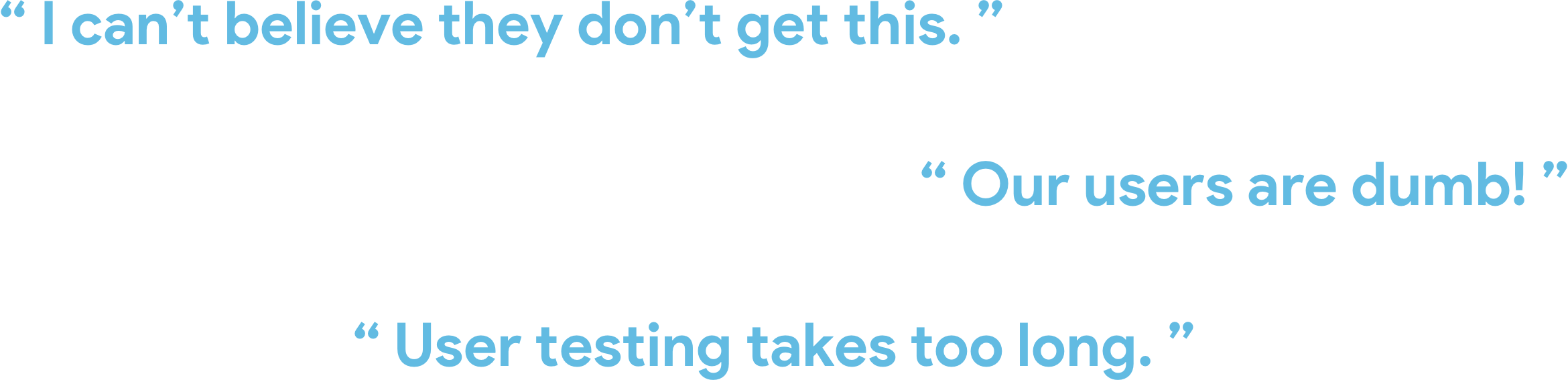
…these were just some of the things I heard during my first couple weeks on the project. I knew for this to be successful I needed to not only improve the user experience of the application, but I also needed to campaign and promote to an established team the value and importance of considering the needs of the user first and foremost.
Meet Wanda
My first goal was to understand who we were designing the application for. What were the different types of users we were targeting and how were their needs different from one another? Through meetings with the product team I learned we had two primary user types: Employers/Teachers and Employees/Students. Employers were primarily concerned with creating training content and tracking completion of that content whereas employees were more focused on completing the content assigned to them but also on sharing content for other employees.
I lead working sessions with the team to understand the differences between these two users as well as identified other user types (ie: Organizational Admins) that we would also need to consider. From these discussions came our first proto-personas. The team hadn’t been working with personas so I introduced them to the concept and explained the importance of “humanizing” our users and the benefits behind having a unified vision across the team of who we were designing for.
Understanding the bigger picture
Now that we knew who we were designing for, the next challenge was to design a structure for the application that would allow it to evolve and grow over time. The main navigation had over a dozen different links, many of which were too similar in nature to allow a user to easily understand where they’d be going when they clicked on one. The product manager had a wealth of ideas for how to grow showd.me but in its current state, the interface lacked the consistency or hierarchy that would help a user understand the overall structure of the application.
Using the proto-personas as our guide, we created an application map that illustrated not only the current structure but also where new features could go and how we could tailor the experience based on user type (ie: Employers care more about seeing stats and overall employee progress of their training lessons vs Employees who want to quickly see what new training they have to complete)
Defining a workflow
As I was introduced to the team I learned that the current product development process was typically the product manager sharing ideas to the visual designer who would then create a few screens illustrating the gist of the idea after which the screens were passed off to development who were left to fill in the blanks. I quickly identified this as a possible cause for inconsistencies I was seeing in the application and set out to try and mitigate the situation by introducing a more structured process to the team.
My main ally when I began working with showd.me was the project coordinator, she had been left to manage the shifting priorities was noticeably supportive when I offered to create a workflow for the team to follow. I had noticed that certain features were sometimes left unfinished as new features were introduced. Development wasn’t being consulted during the design process and was often given designs they couldn’t develop based on the system’s current capabilities. Lastly, the lack of any kind of written specifications, user stories, or task flows was resulting in broken experiences across the application.

I met one on one with each team member to understand their current way of working and to find out if they had any recommendations on how things could be improved. By closely partnering with the product coordinator, I developed a workflow that increased developer involvement, introduced user testing, task flow creation, low/high fidelity wireframing, interaction rules, design asset management through Invision, and lastly task tracking through Jira.
My goal was to show how following a structured process would result in a more polished, functional, and enjoyable product for our users.
Outcome
After some early growing pains, the new workflow started to take shape and new features were created using the processes it outlined. While the pace at which new features were being released did slow down slightly, the product enhancements that were created were far more thought out and resulted in higher usage rates than previously released features.
Anthiem ultimately replaced the original product manager and increased the size of the showd.me development and design team. What started out as a short-term contract evolved into a multi-year partnership. I was asked to help guide new designers and offered to opportunity to lead the design strategy for any future projects Anthiem undertook.
Under the guidance of a new product manager showd.me continued to grow. I helped create user stories, designed task flows and comps for new features, and worked closely with our new user researcher to test prototypes and leveraged findings to further improve the application.
Under the new design process I worked with our project coordinator to create use cases for each new feature and helped define any necessary acceptance criteria.
Working with two other designers, I lead the design initiative behind the creation of Learning Paths. A component which would go onto become showd.me’s most used feature.
Learning Paths provided a structured way for employers to share content with employees and track/monitor completion rates.
We completely redesigned the existing Chat Sessions to allow for: online testing, notes taking, and screensharing
I partnered with our user researcher to conduct remote user testing sessions to validate our design direction and uncover any unknown usability issues.
The future of showd.me
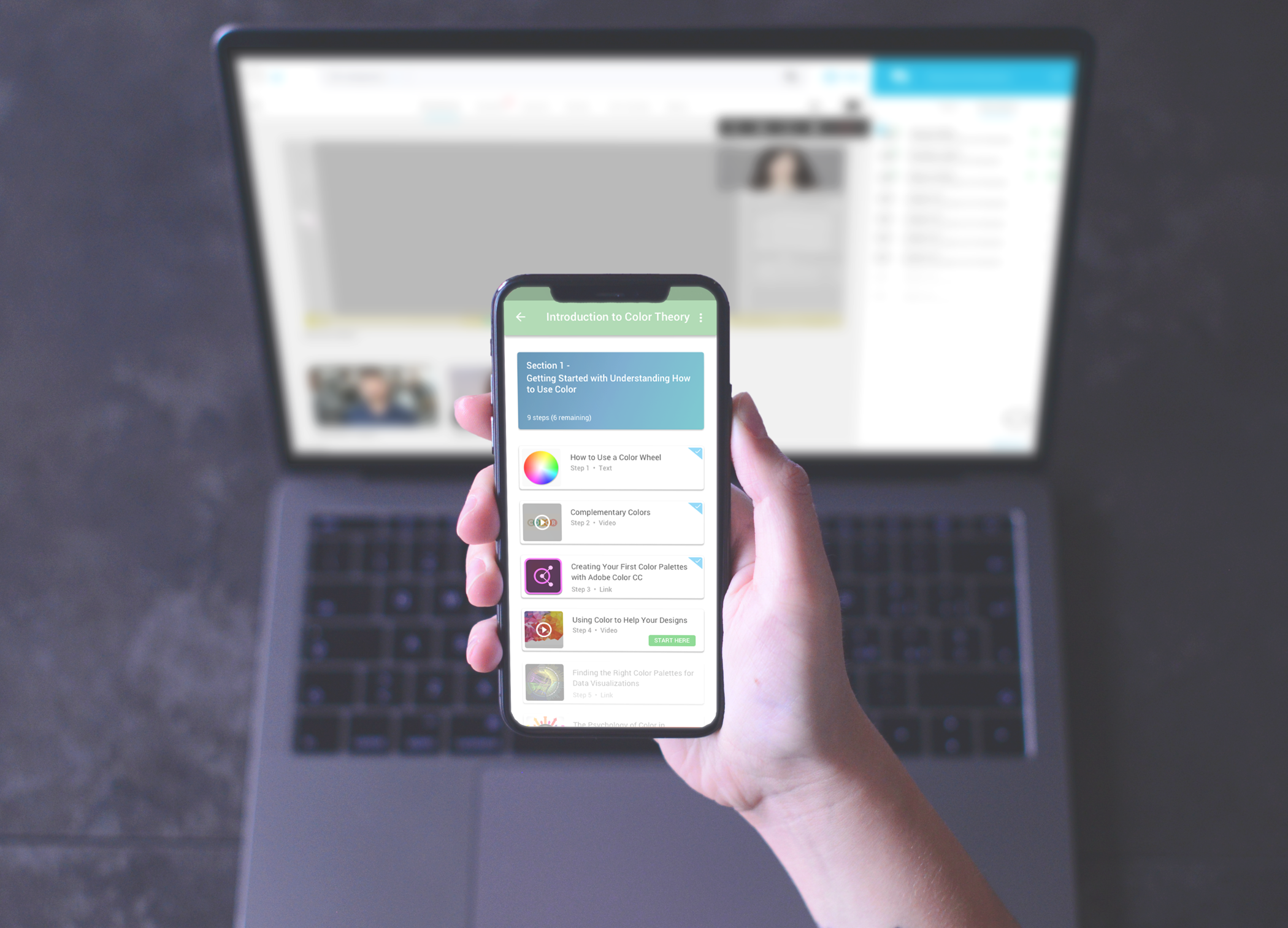
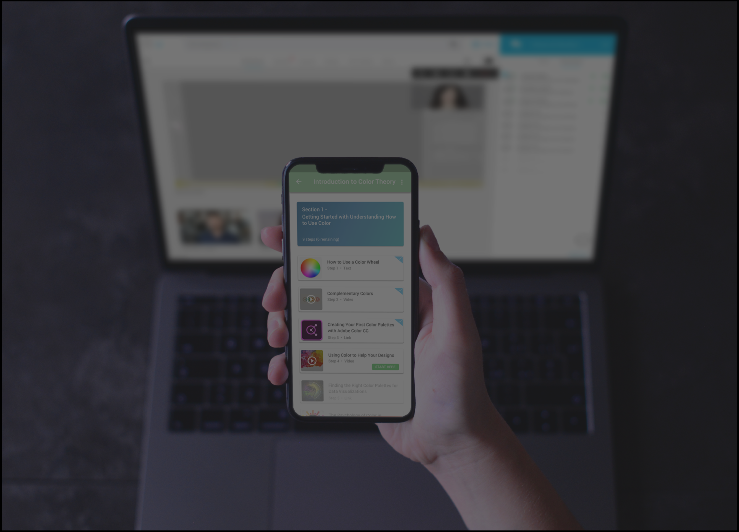
As showd.me grew, so did my responsibilities. In addition to taking on more visual design work, I began designing a mobile version of showd.me focused around the application’s key features. More and more companies were asking for mobile support so the team worked together to map out what a mobile version of showd.me would need.
Through user interviews and site metrics we discovered that the structured training lessons (Learning Paths) and the Profile section were the two most used sections of the application. We took that information and began to created a streamlined mobile version of showd.me that allows users to complete their training on the go as well as track their progress through an updated profile view.
Final thoughts
It was incredibly rewarding to see how my steadfast belief in always putting the user first and closer collaboration across teams helped lead to the adoption of a design process that Anthiem Ventures now follows for all its projects.
Each year showd.me continues to grow. In 2017, showd.me targeted the home-care industry and was quickly adopted by over a dozen agencies as its preferred platform for training home-care aids. My work with Anthiem Ventures didn’t stop at showd.me. During my time there, I lead design initiatives for numerous clients using similar methods to guide their projects through the design process.

“David has been wonderful to work with! His big picture view of user experience design helps to keep user needs in perspective, but he is also able to translate that into beautiful, detailed designs on web and mobile apps alike. Working remotely can sometimes be a challenge, but David's great communication skills makes it a breeze! I would definitely recommend working with David for wireframing to final UI design and everything in between.”
— Holly DeWolf | User Experience Designer and Researcher